Please Note: ABG of Michigan is now part of EPIC Retirement Plan Services and no longer uses the ABGMI brand. These archived brand assets are displayed here only for the purposes of this portfolio.

ABGMI Visual Identity
ABGMI is a Michigan-based regional service office of one of the largest retirement plan administration organizations in the United States. They say they’re big enough to handle complexity, but small enough to manage the minor details, and we help them show up as a trustworthy national brand every day.
When ABGMI teamed up with GSM, they felt that their brand and look at the time felt dated and stale; they asked us to help develop a visual identity that made them look stronger and more contemporary, but without losing that classic formality for which they were recognized. We accomplished this by simplifying what they already had down to what was essential to their identity, and then cementing it with a range of crisp defining motifs.
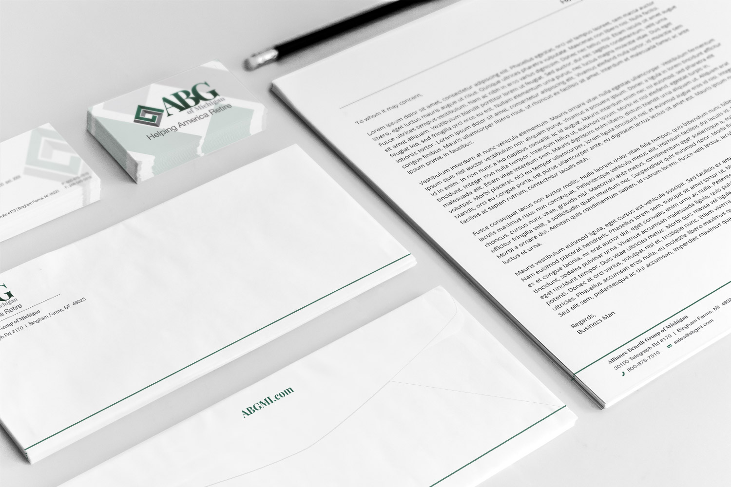
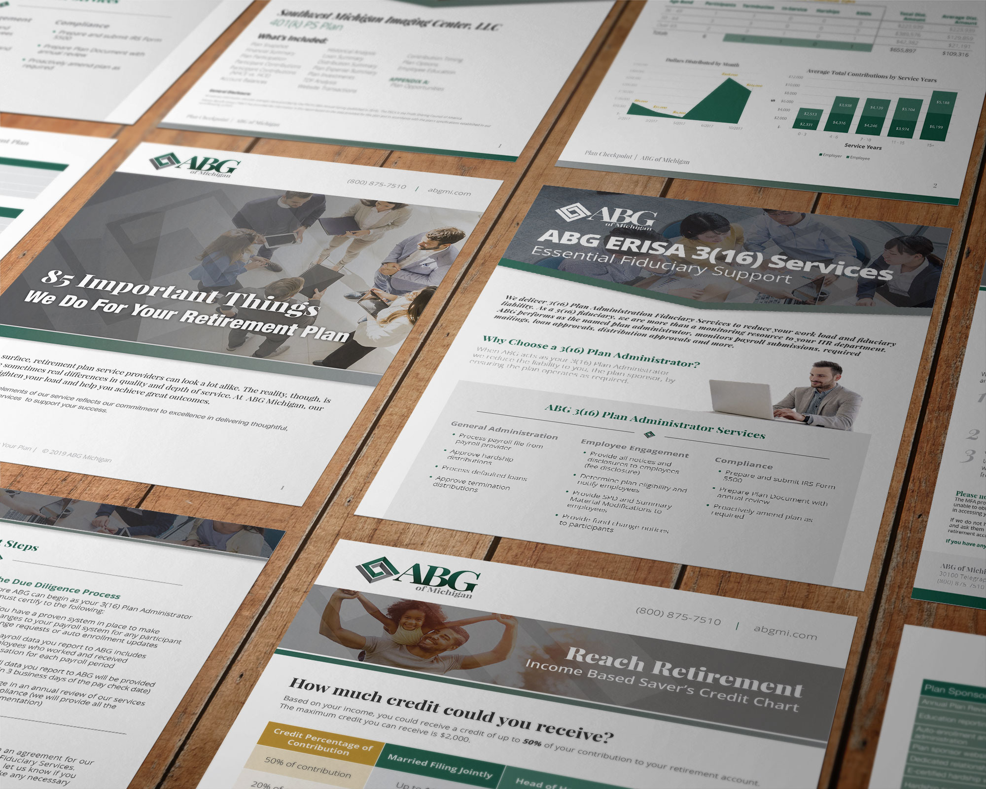
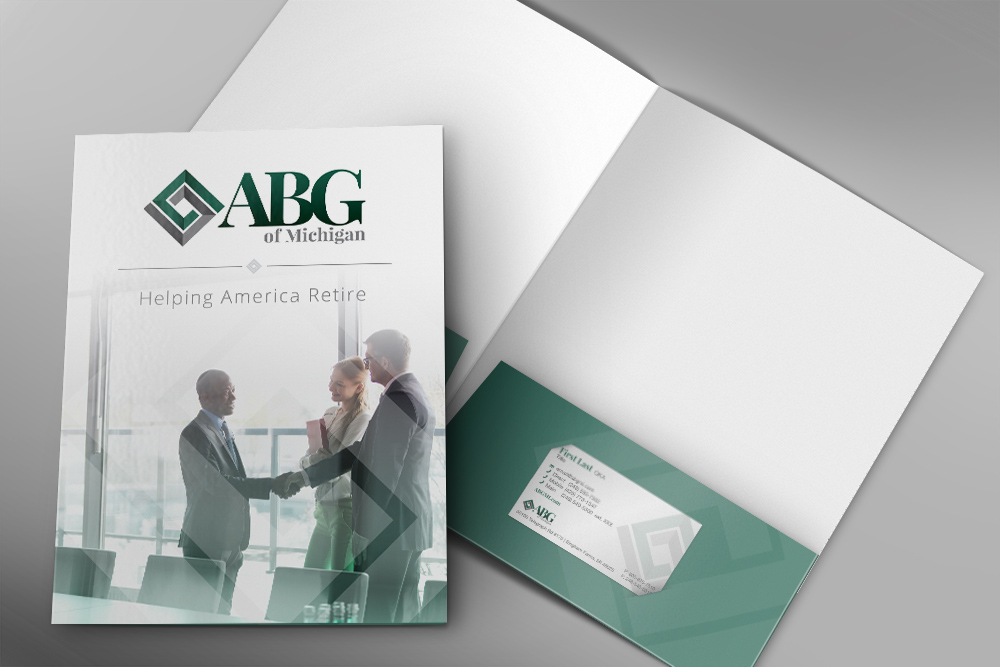
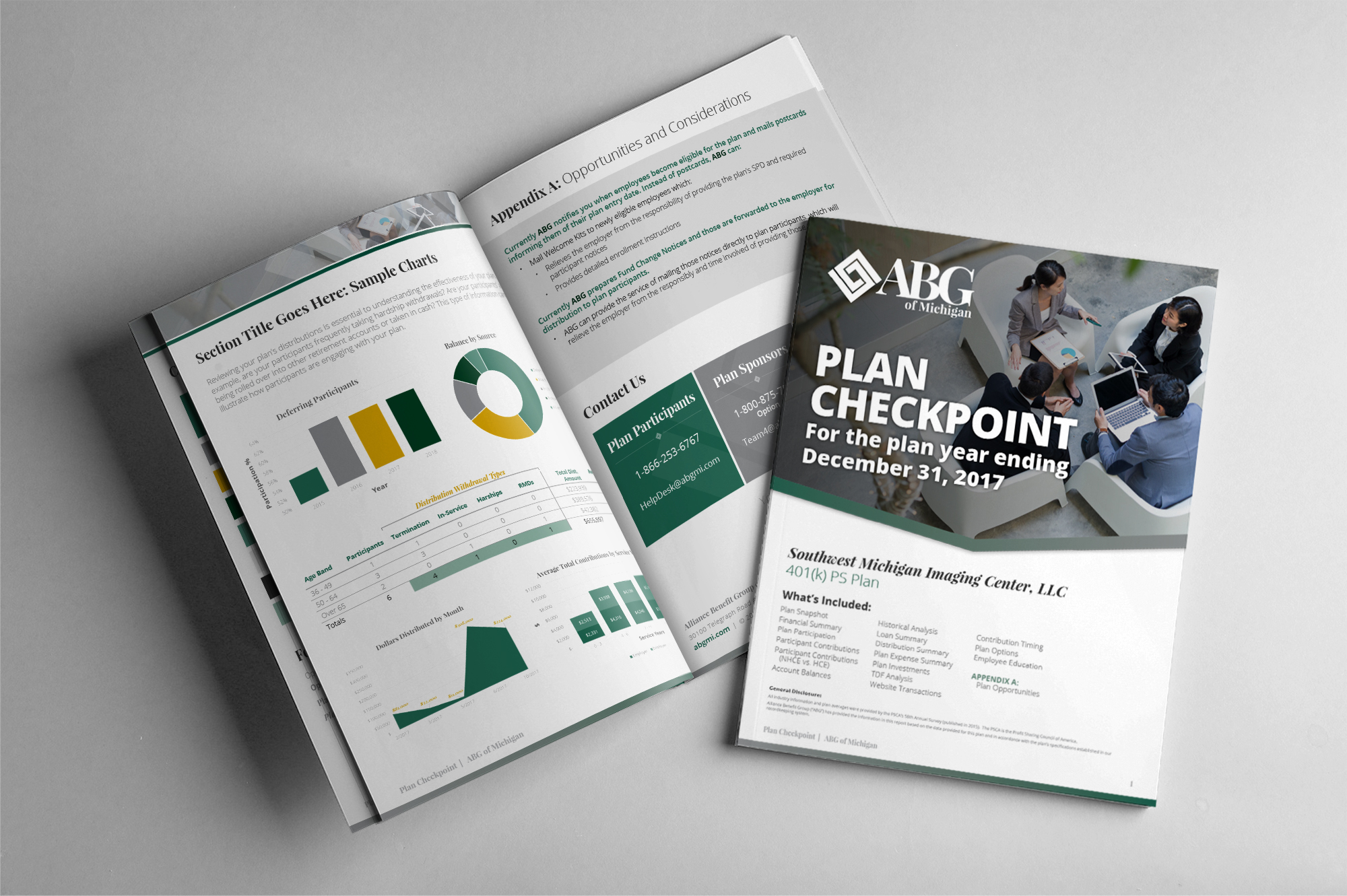
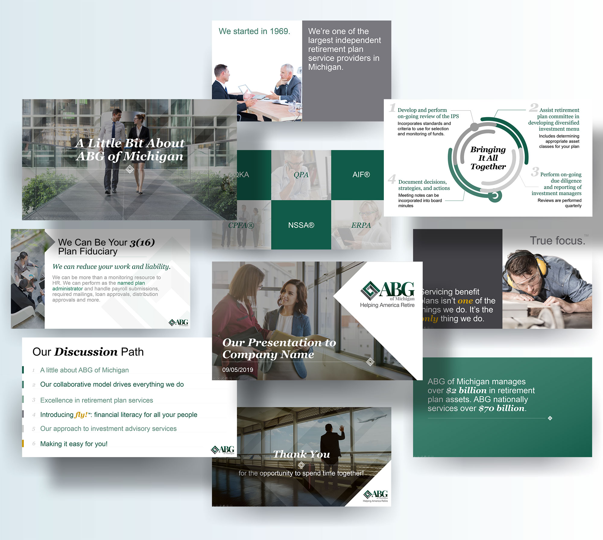
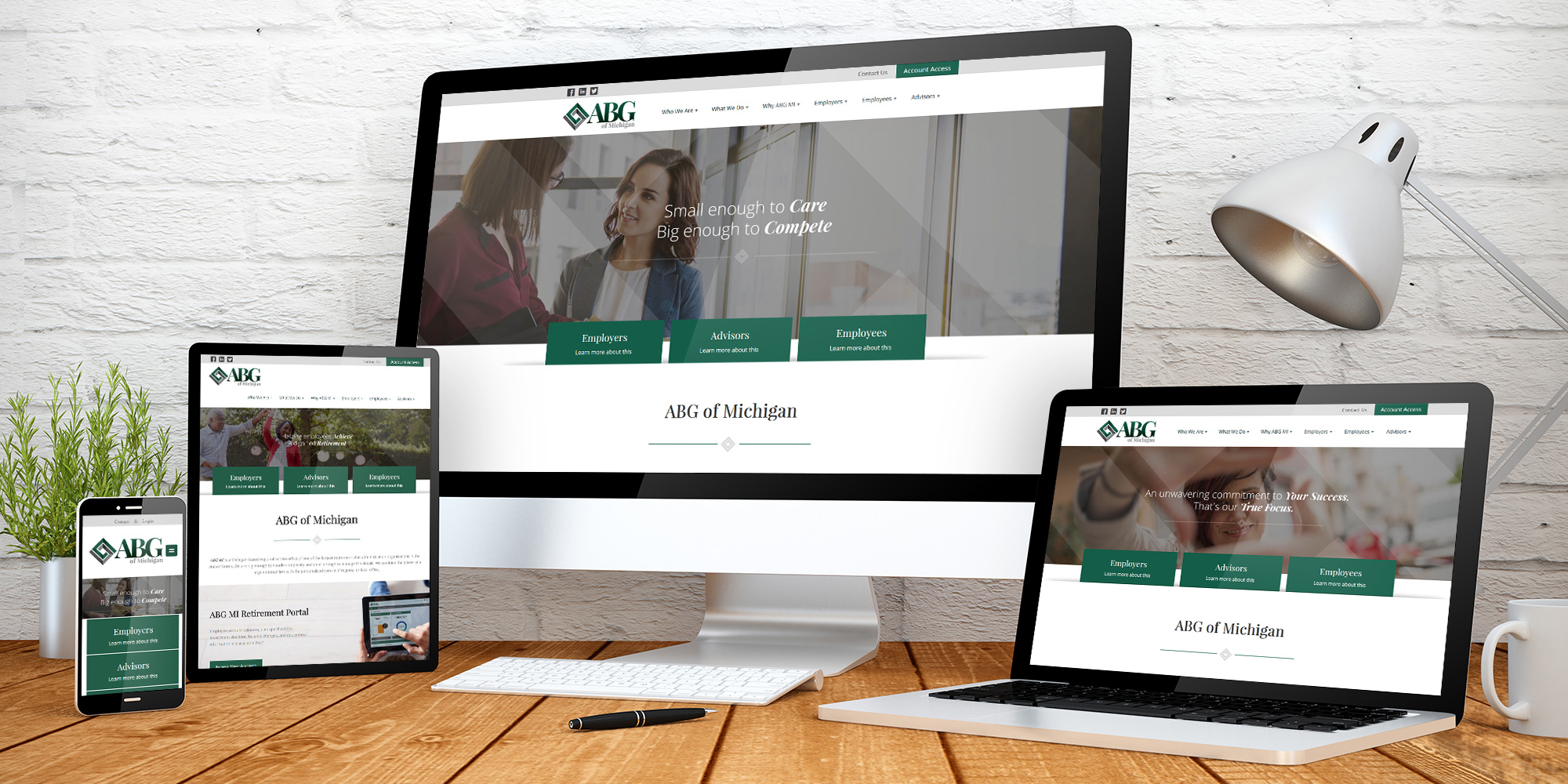
We updated every element of ABG MI’s brand image including business cards, envelopes, letterheads, brochures, custom reports, and any medium that would demonstrate their professionalism in the retirement industry.
Projects:
Branding Motifs & Identity, Logo, Stationery & Business cards, Flyers, Proposals & Brochures, Website Development, Custom Video
color + fonts
Playfair Display
ABCDEFGHIJKLMNOPQRSTUVWXYZ
Open Sans Light
abcdefghijklmnopqrstuvwxyz
Playfair Display Bold Italic
abcdefghijklmnopqrstuvwxyz

logo
imagery

icon style
corporate stationery

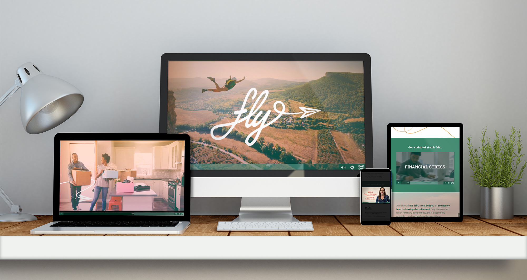
custom video

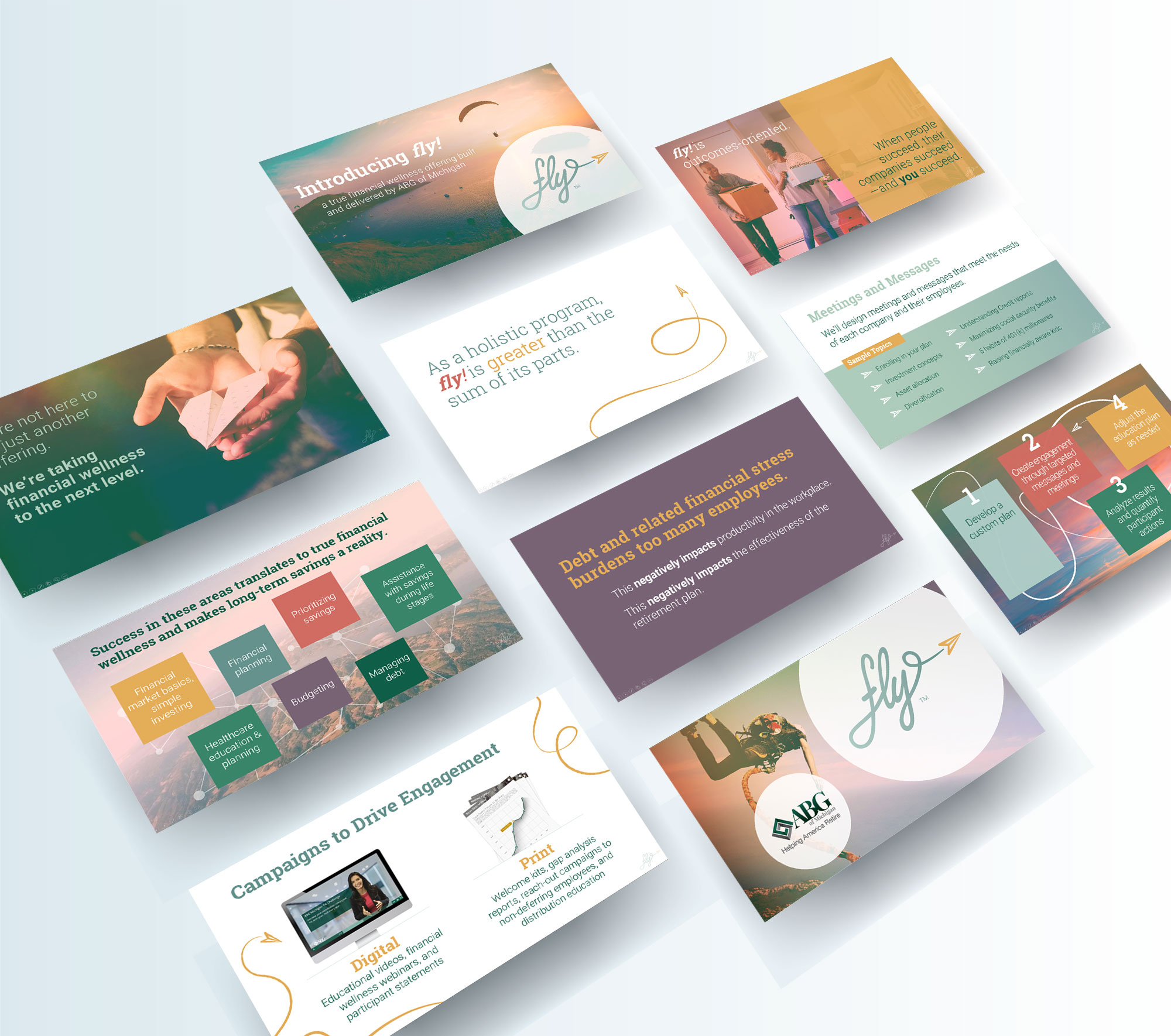
presentation deck
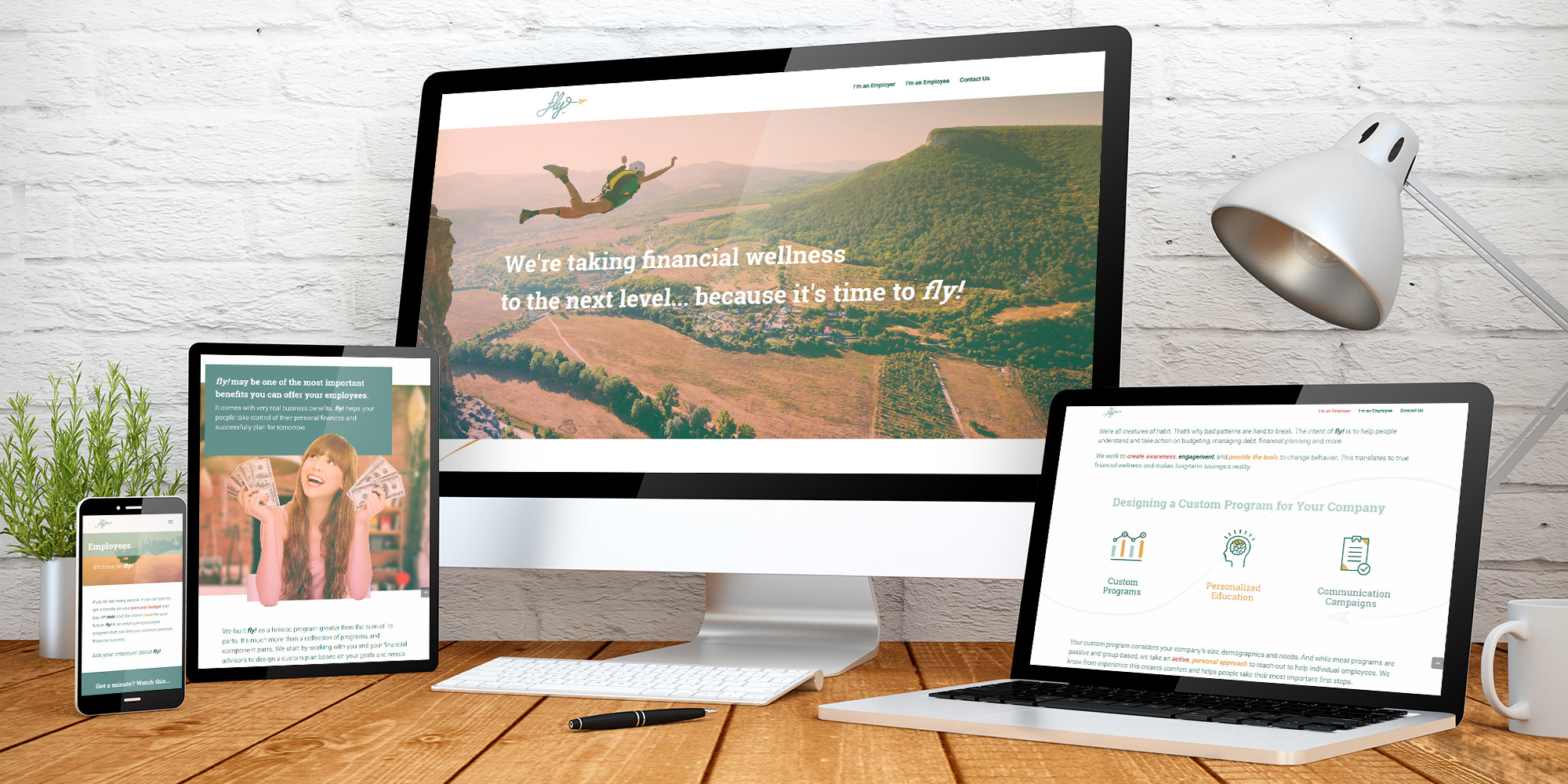
website design

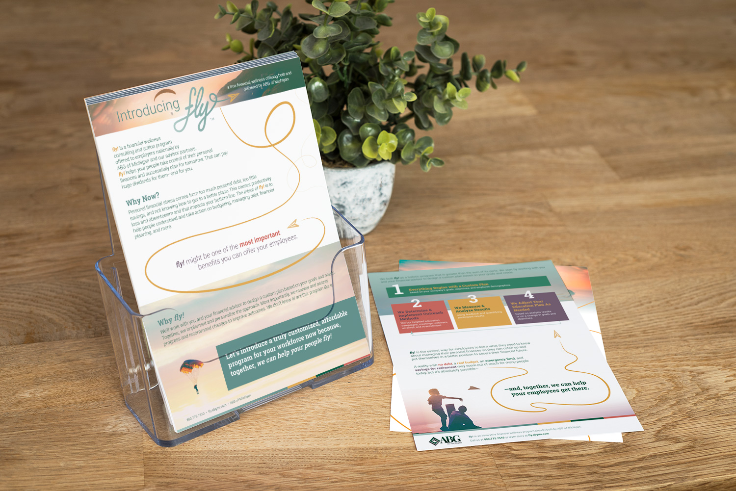
child brand: fly!
We built ABGMI’s financial wellness brand, fly!, to be all at once distinct from and harmonious with ABGMI’s visual brand. fly! stands apart as a more aspirational, energized, participant-targetted concept, but does so while using a color palette and style that marries easily to the more institutional, buttoned-up style that is ABGMI.