Red Bank Pension Services Visual Identity
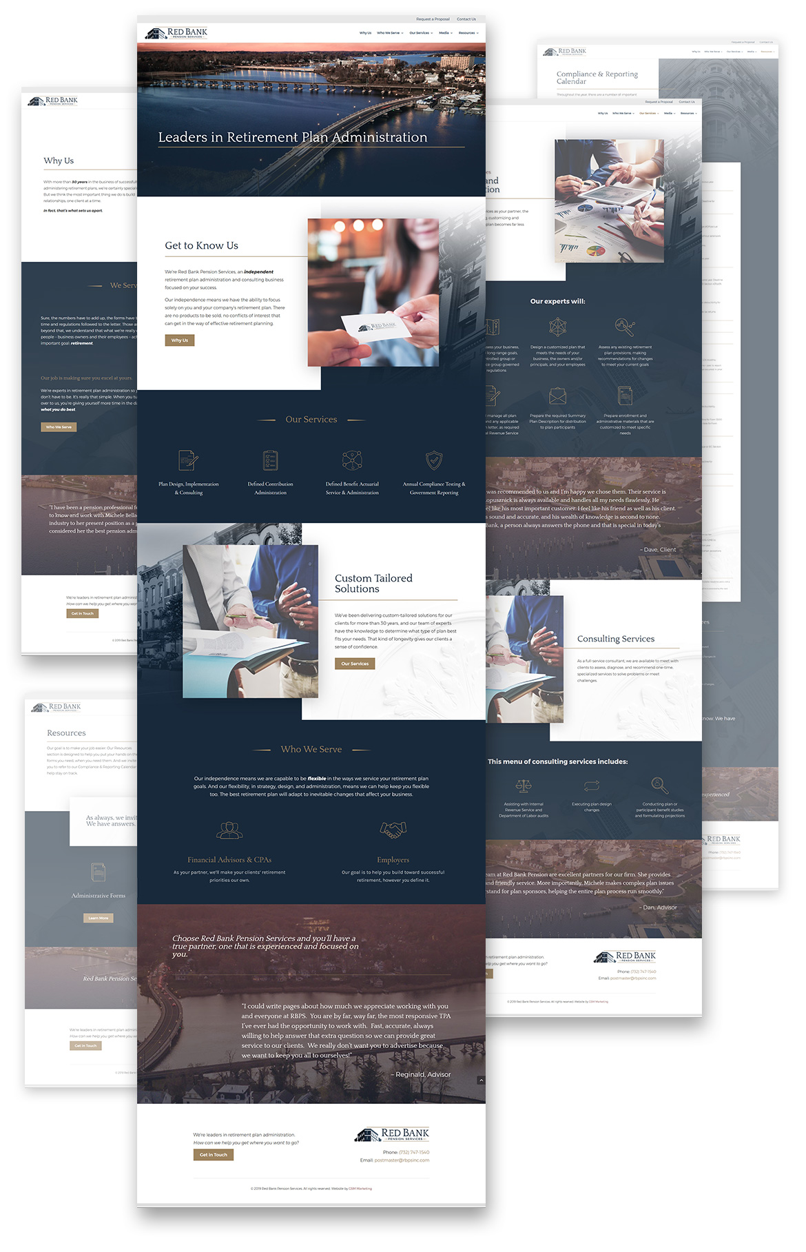
When Red Bank Pension Services teamed up with GSM, it had been a while since their website and visual style had undergone an update. They wanted to elevate their yellow swooshes and black-and-white blocks of text into a brand new visual space that reflected the success of their present-day business.
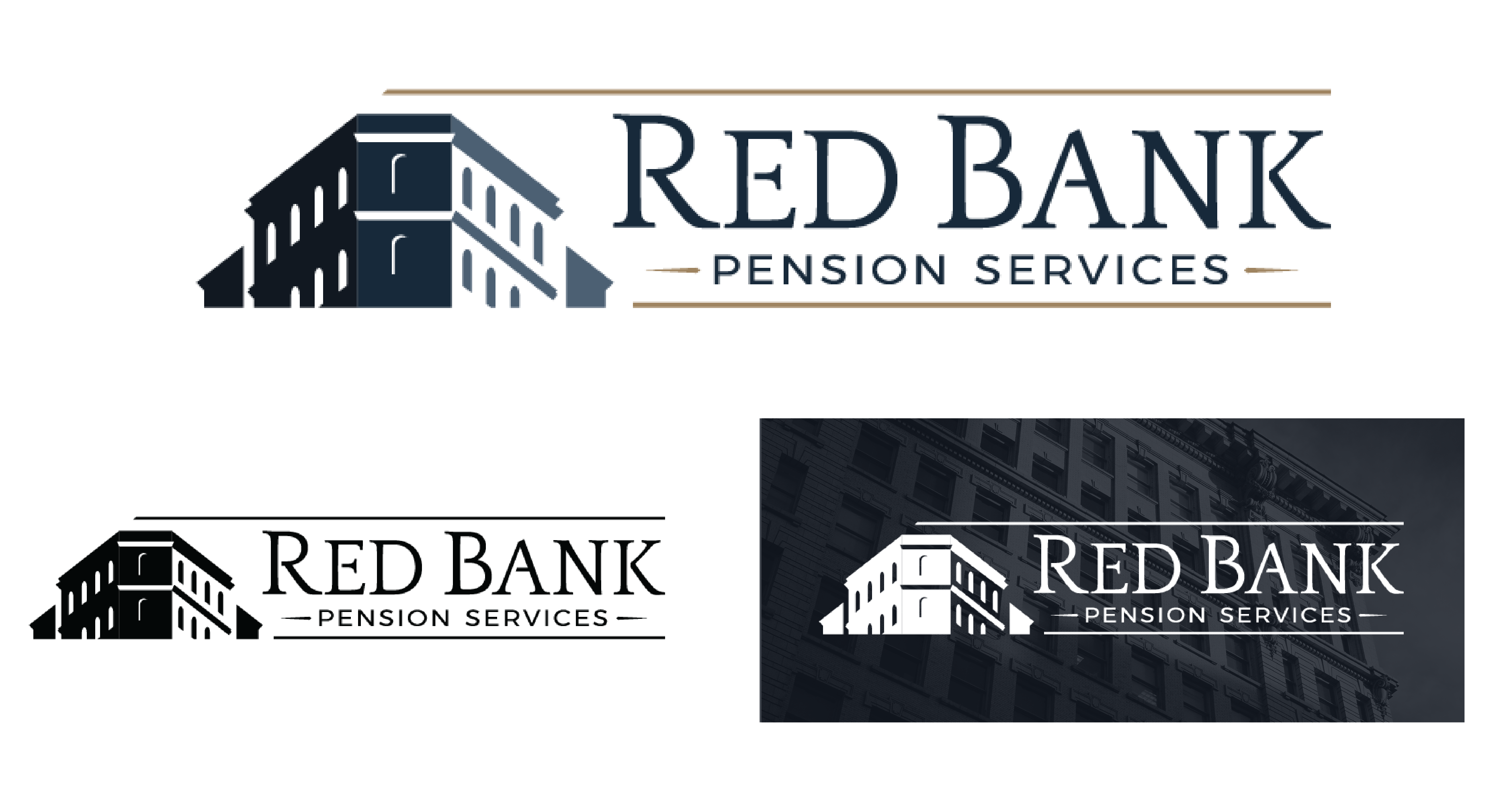
We started first with their logo, embracing Red Bank Pension Services’ locally-driven business posture and the beautiful architectural heritage of their namesake region. We brought the iconic style of that architecture into their logo concept, and in doing so we captured the implicit sense of stability and majesty that comes with strong walls and angled skylines. It came together from there with a sapphire-and-brass color palette, classical typography, and a touch of delicate, formal ornamentation.
With Red Bank Pension Services’ final logo in hand, the rest of their identity came together naturally. A selection of Victorian architectural elements came together with dark, velvety swathes of blue, sweeping regional landscapes, and fine, brass-toned ornamental accents, popped with a rich berry red tone for variety.
Services Provided
Branding & Identity, Logo Design, Web Development
color + fonts
Quattrocentro
ABCDEFGHIJKLMNOPQRSTUVWXYZ
Montserrat Regular
ABCDEFGHIJKLMNOPQRSTUVWXYZ

logo
imagery

icon style
website design