
MAP Retirement Logo
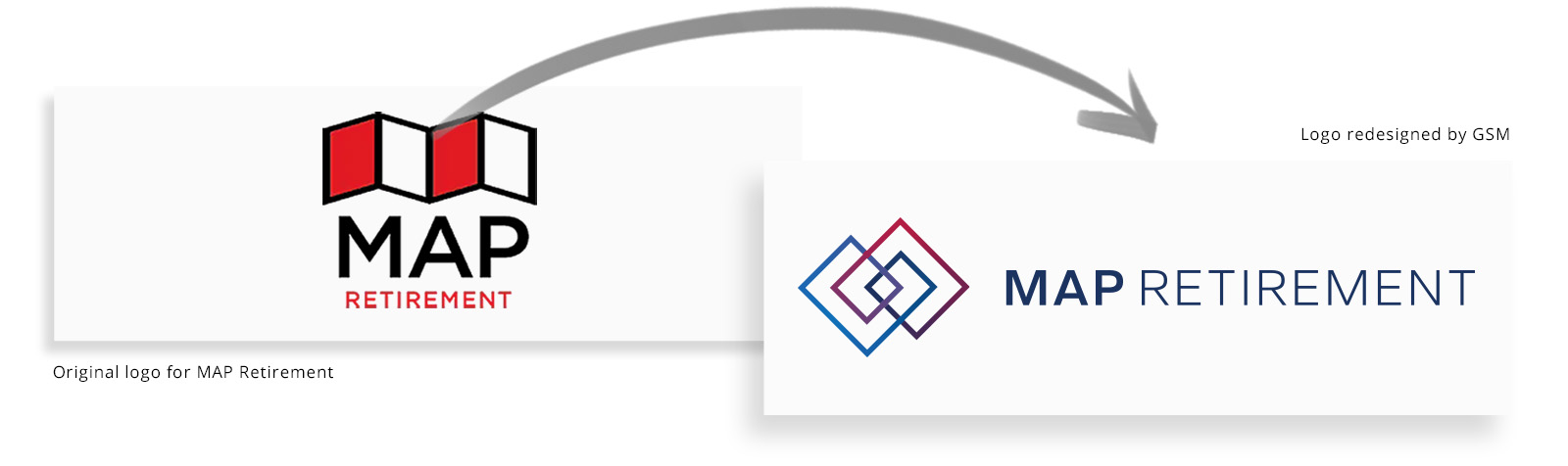
When seven prestigious, entrepreneurial TPA organizations (and growing!) all teamed up to form a new, all-star network of services, they knew they needed a new name and identity to represent the powerhouse provider they had become.
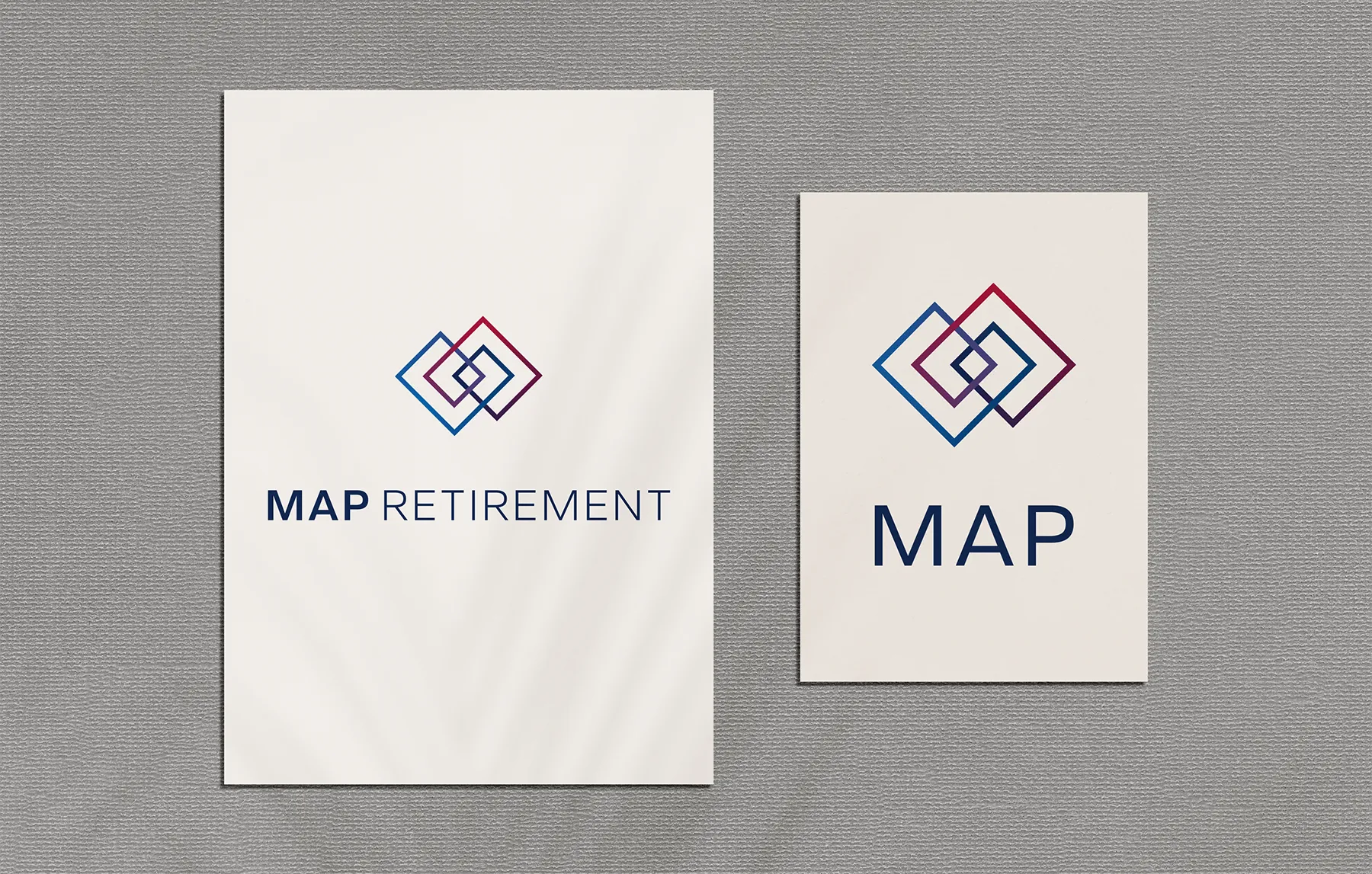
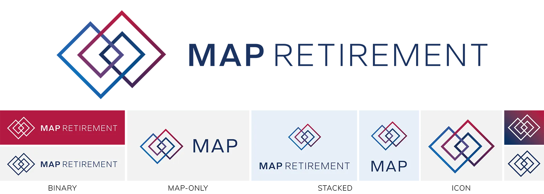
We worked together to create a clean new logo that expresses their values of guidance, security, and trustworthiness in a way that looks like it belongs to a nationally-competitive, institutionally-respected firm. We also sought to capture themes of unity, networking, and interconnectivity that harken to the origin story behind the MAP brand.




Logo Design Process
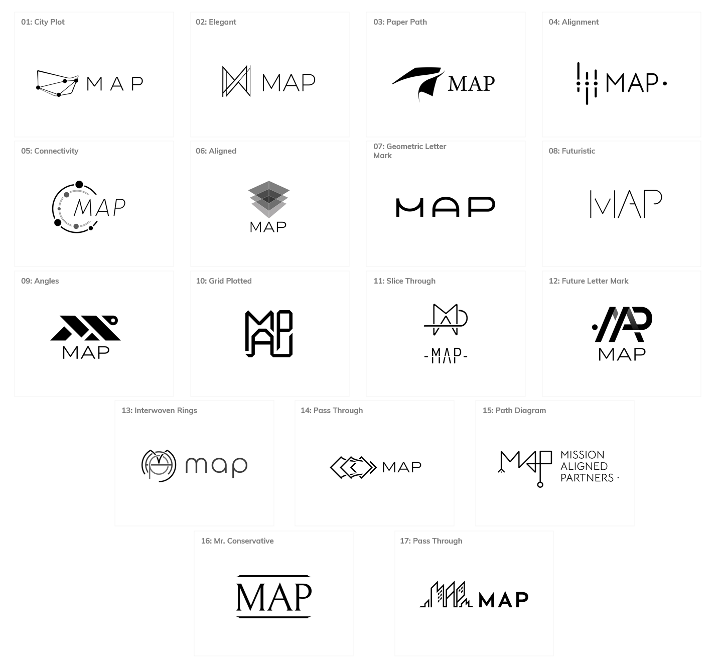
Round 1
Exploring a range of initial ideas
Round 2
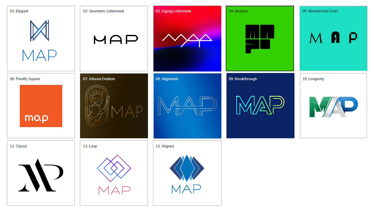
We presented the strongest ideas to the MAP team, realized in full color and covering a range of visions and directions that could capture the new chapter of their brand identity.

Round 3
The MAP team wanted to see more ideas, pushing even farther outside of their familiar and comfortable box, so they could better understand which ideas and directions resonated with their new identity.
Round 4
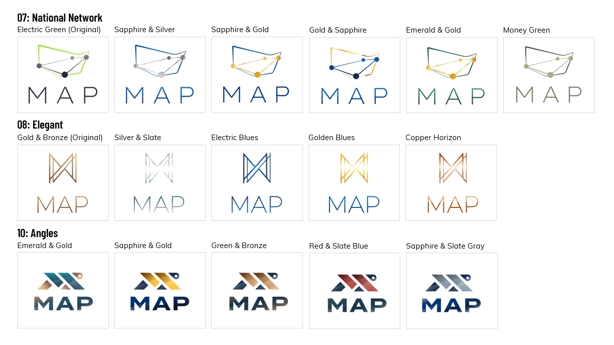
We narrowed in on a few favorite concepts, exploring and refining details to the team’s taste and working toward a final choice.
↓
Round 5
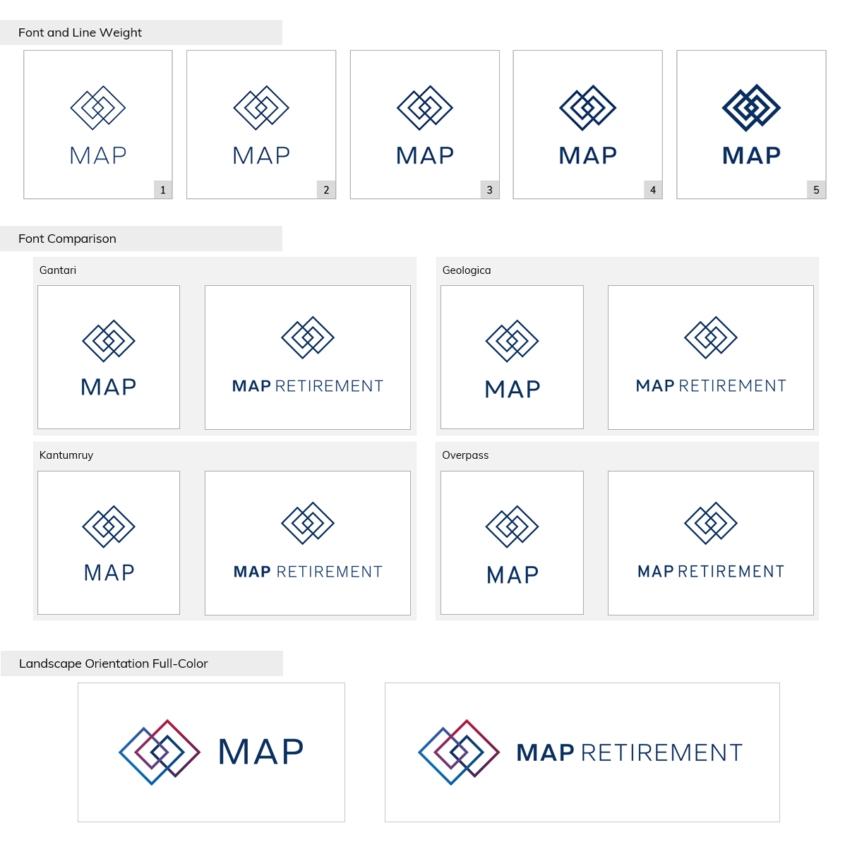
Locked in on a final favorite, we went through a final round exploring details like specific colors, line weight, and typography to ensure the team felt confident in the exact, perfect tone of this new identity.
↓
Final Logo Design

