


MAP Retirement Visual Identity
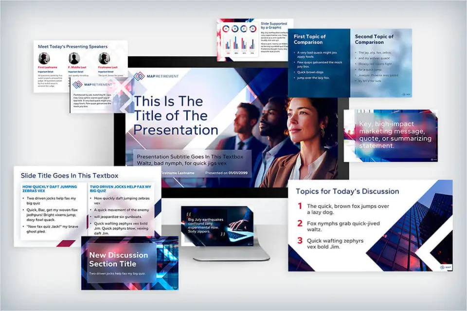
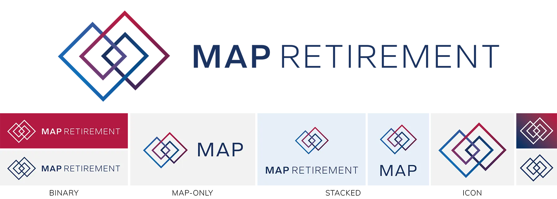
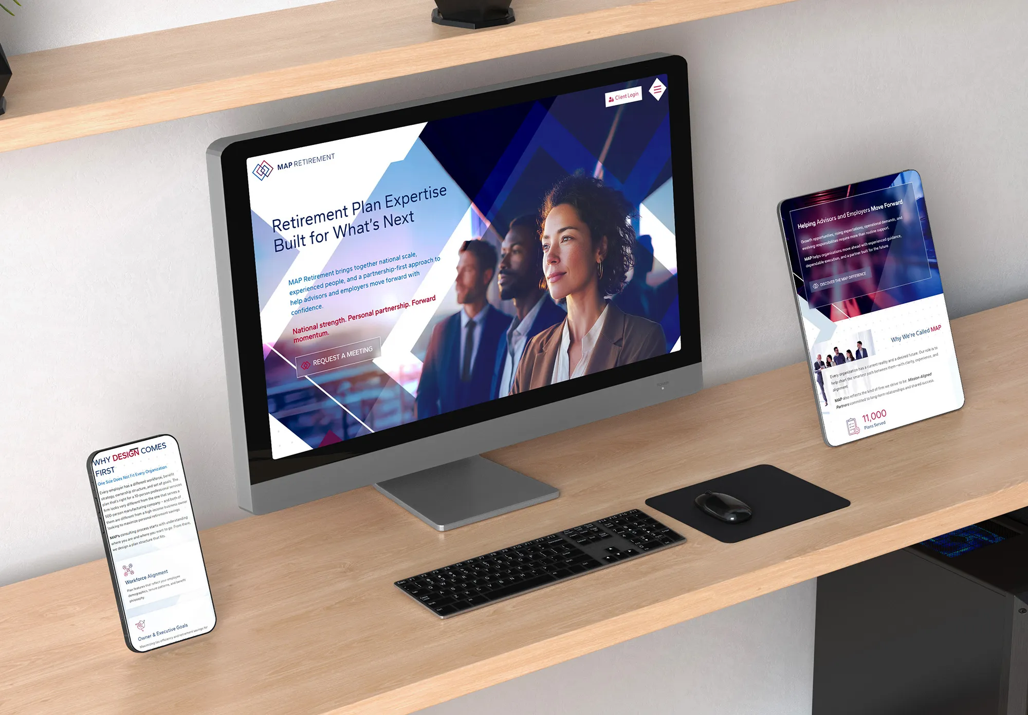
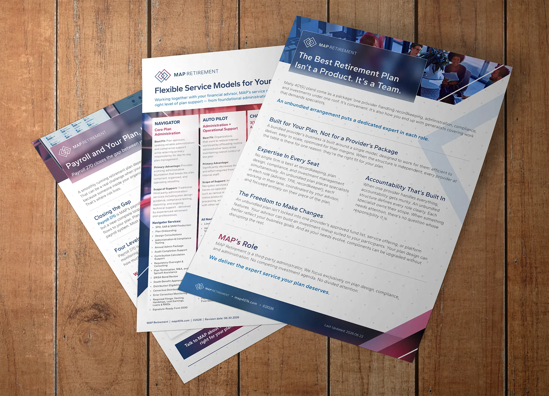
Unifying multiple prestigious TPA and consulting firms into one powerful, national institution, MAP Retirement needed a new brand identity that captured the expertise and esteem of its team. Together with GSM, they launched an updated company identity complete with a new logo, new messaging style, and all-new visual theme.
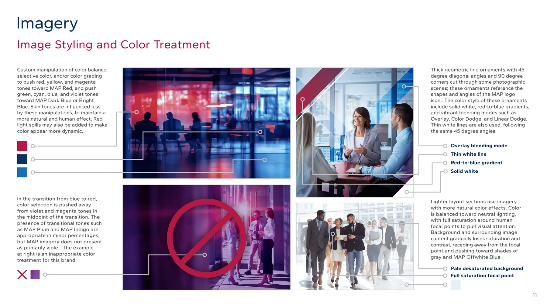
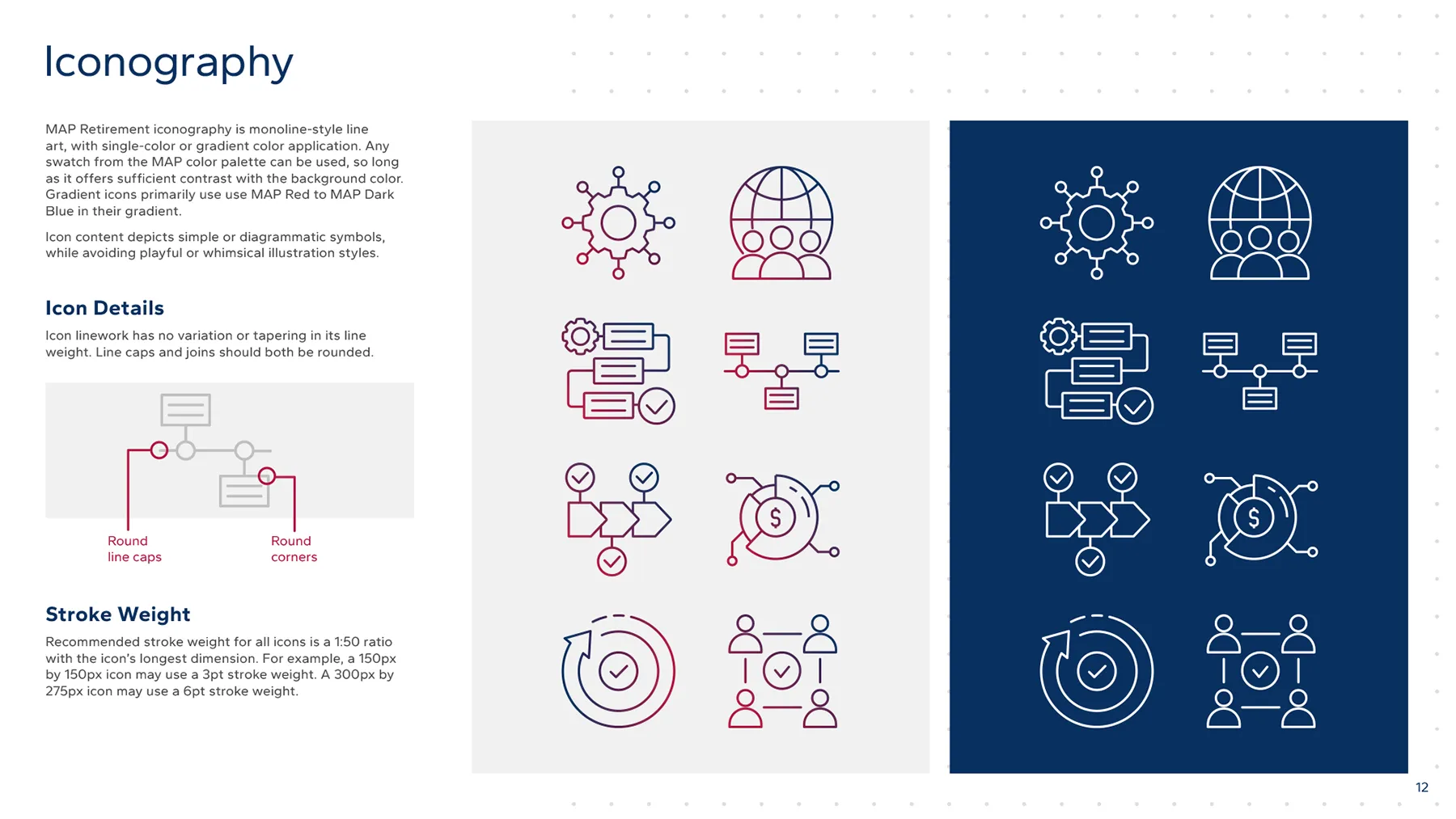
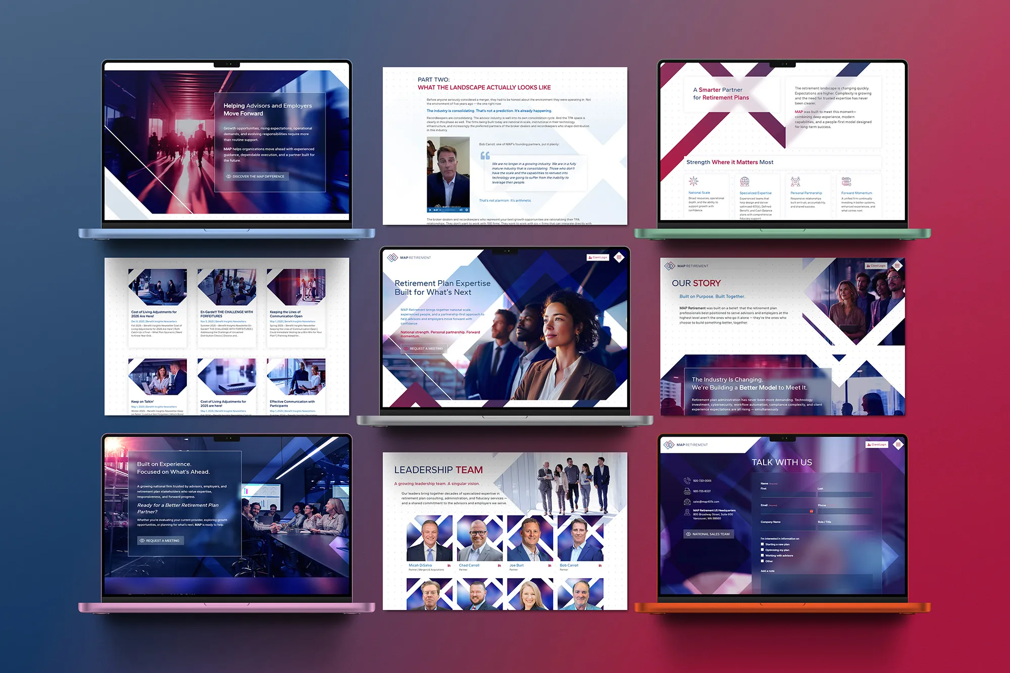
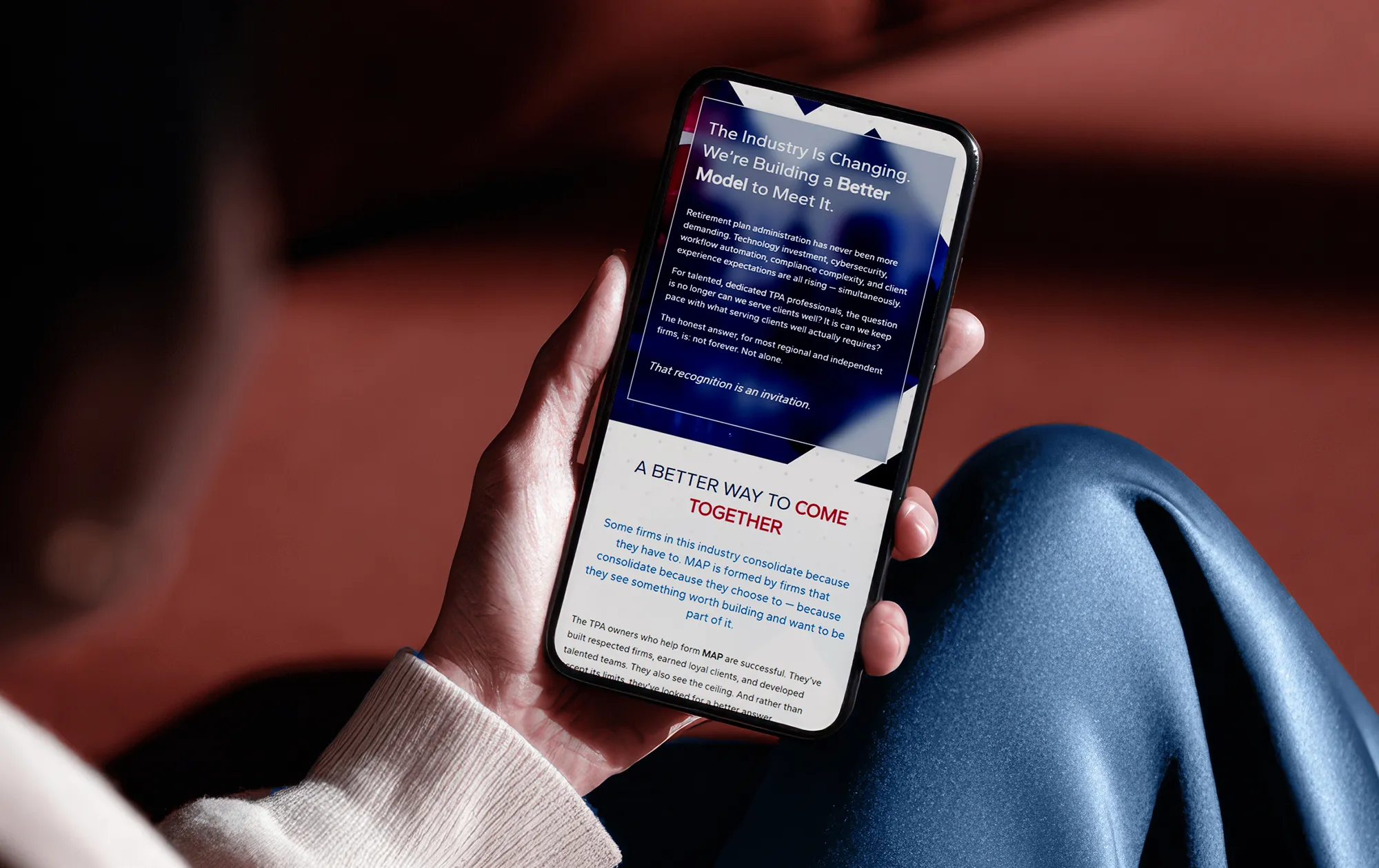
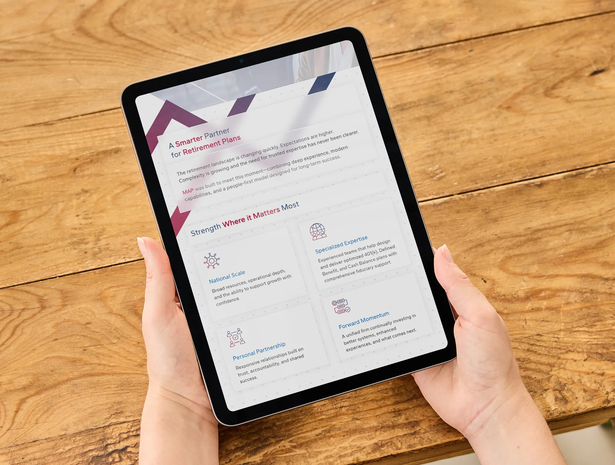
MAP’s original visual identity tells the story of institutional elegance and rich professional confidence, and how their national scale intersects with a personal touch. Clean lines, glassy gradients, smooth geometric typography, and light breaths of white space—with these, consumers and partners alike come away with the sense that MAP is an upright, contemporary organization that presents itself with professional elegance and prestige. Decisive and bold use of color and imagery conveys a strong, assertive presence throughout MAP’s branding. Richly saturated fields of jewel-tone color and sharp, daring geometry slicing through layouts command attention and pull the eye through each message.
Overall, this visual identity balances the power of MAP’s national network with the quality of service offered by TPAs who know each small business and sponsor by name.
Services Provided:
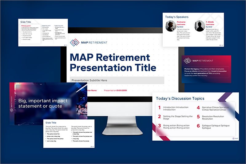
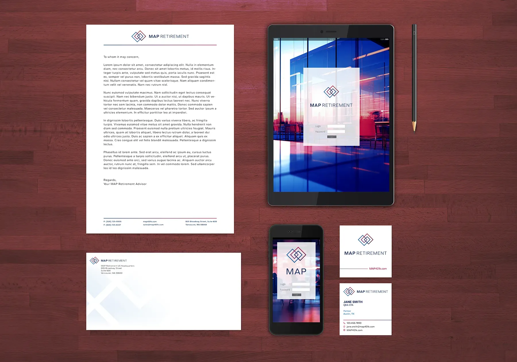
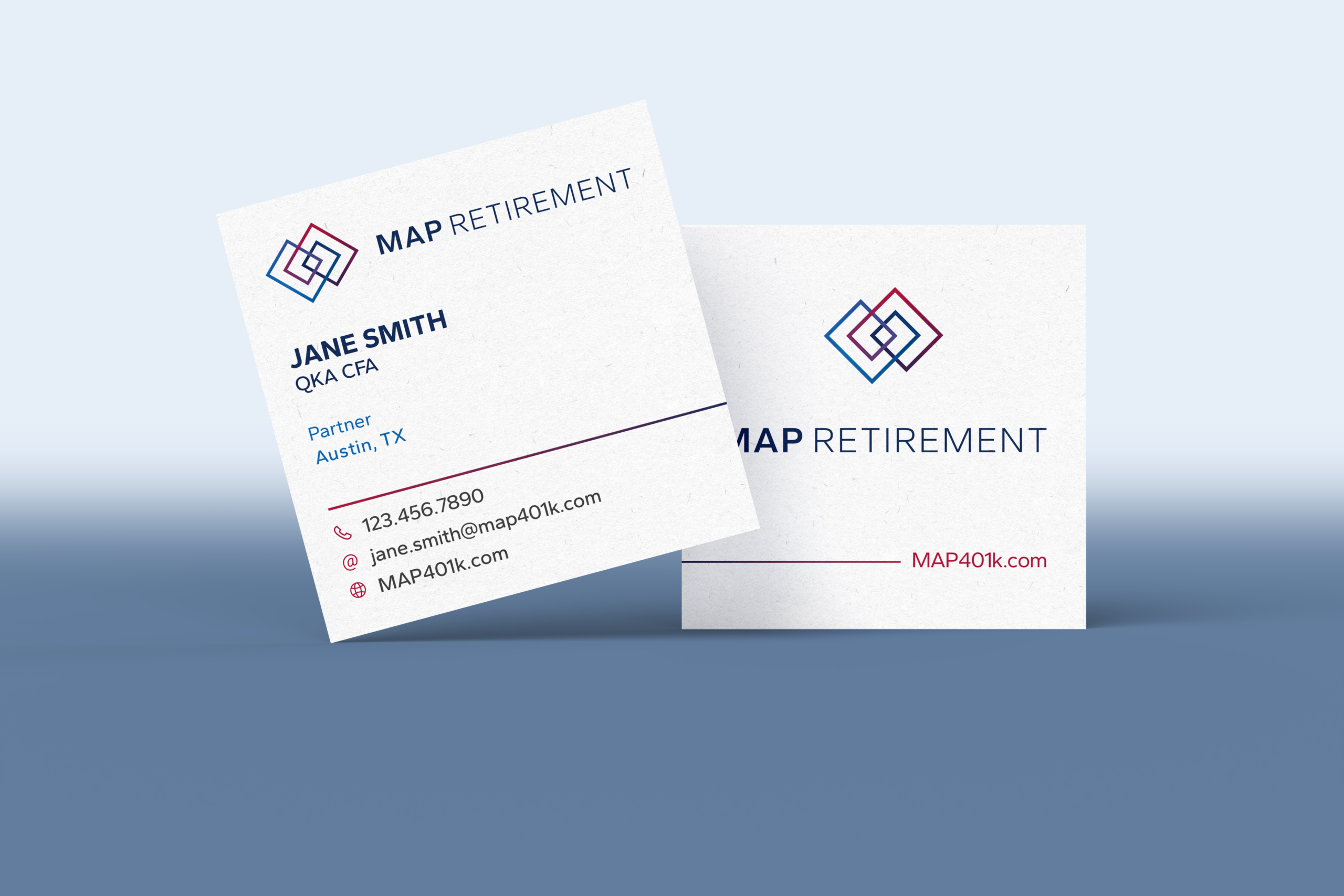
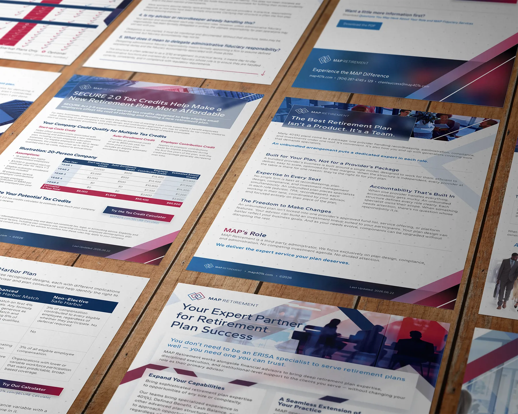
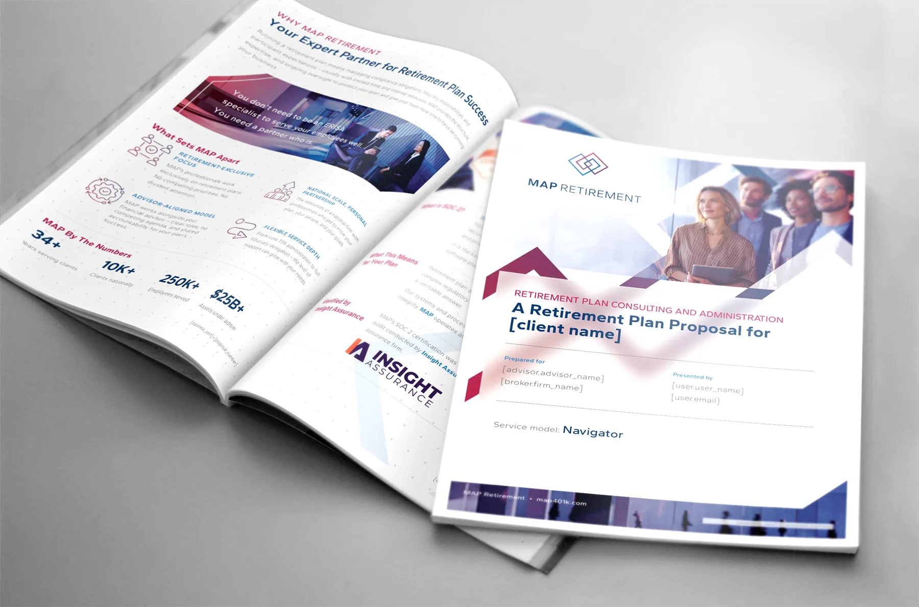
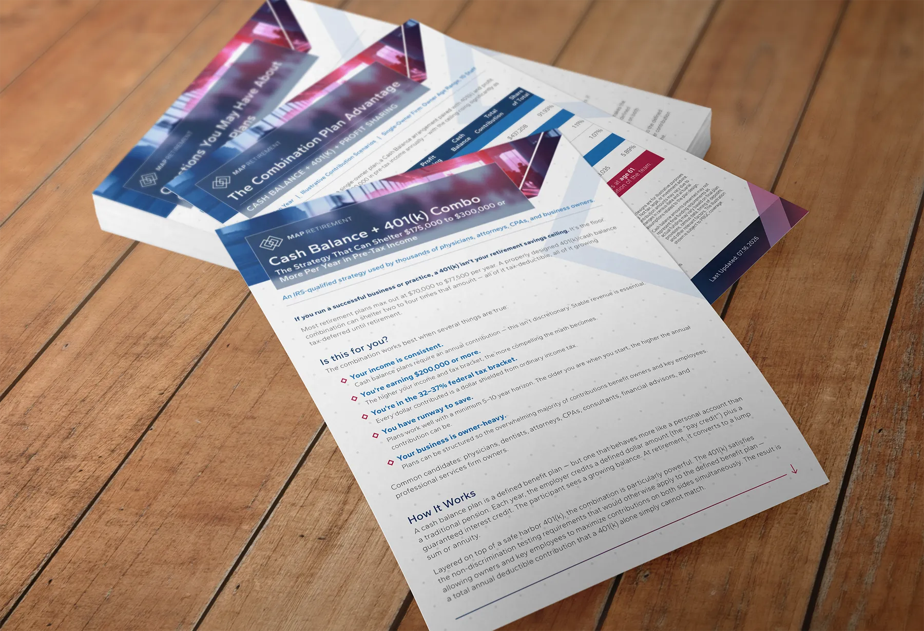
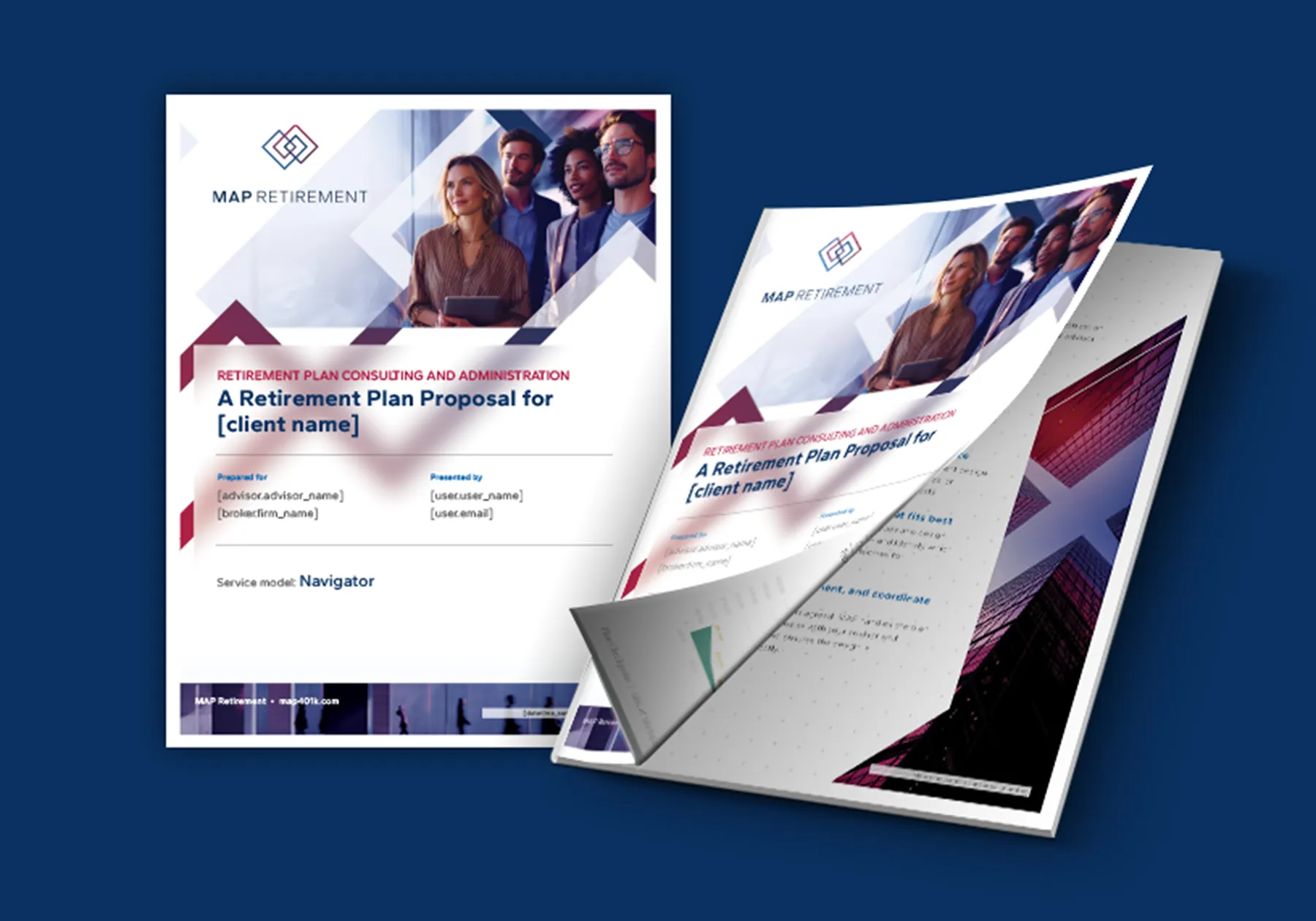
Branding Motifs & Identity, Logo Design, Website Development, Presentation Master Template and Custom Builds, Webinar Event Management, Single- and Multi-Page Collateral, Editable Proposal Design, Custom Video Production
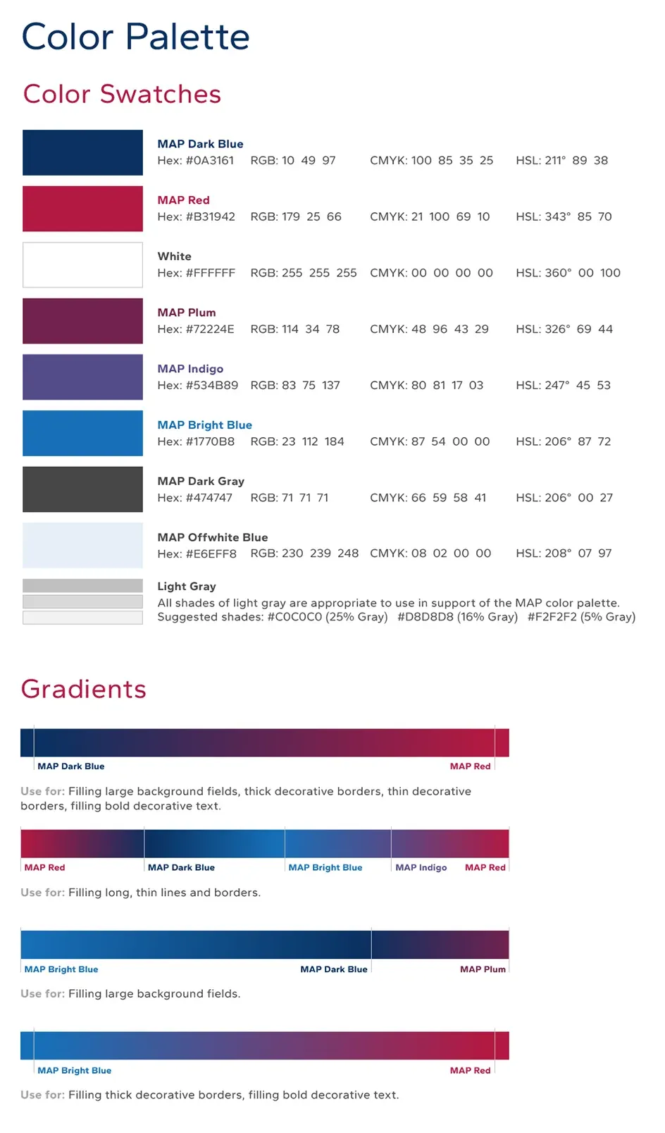
color + fonts
Gantari Bold
Main Headings
ABCDEFGHIJKLMNOPQRSTUVWXYZ
Gantari Regular or Bold
Subheadings
ABCDEFGHIJKLMNOPQRSTUVWXYZ
Gantari Regular
Body Copy
ABCDEFGHIJKLMNOPQRSTUVWXYZ
Gantari Medium Italic
Call-out Statements
ABCDEFGHIJKLMNOPQRSTUVWXYZ
imagery

Stationery



presentation