Latitude Retirement Visual Identity
The Niles Langford Group of retirement companies—comprised of NLG, RSA, RSC, and Pension Systems—found that their mosaic of different identities no longer effectively served their purposes. As a list of several individual entities, it became complex and labored to talk to partners about how their collaboration empowered them with stature and experience on a national scale. That in mind, they decided it was time to revisit their brand.
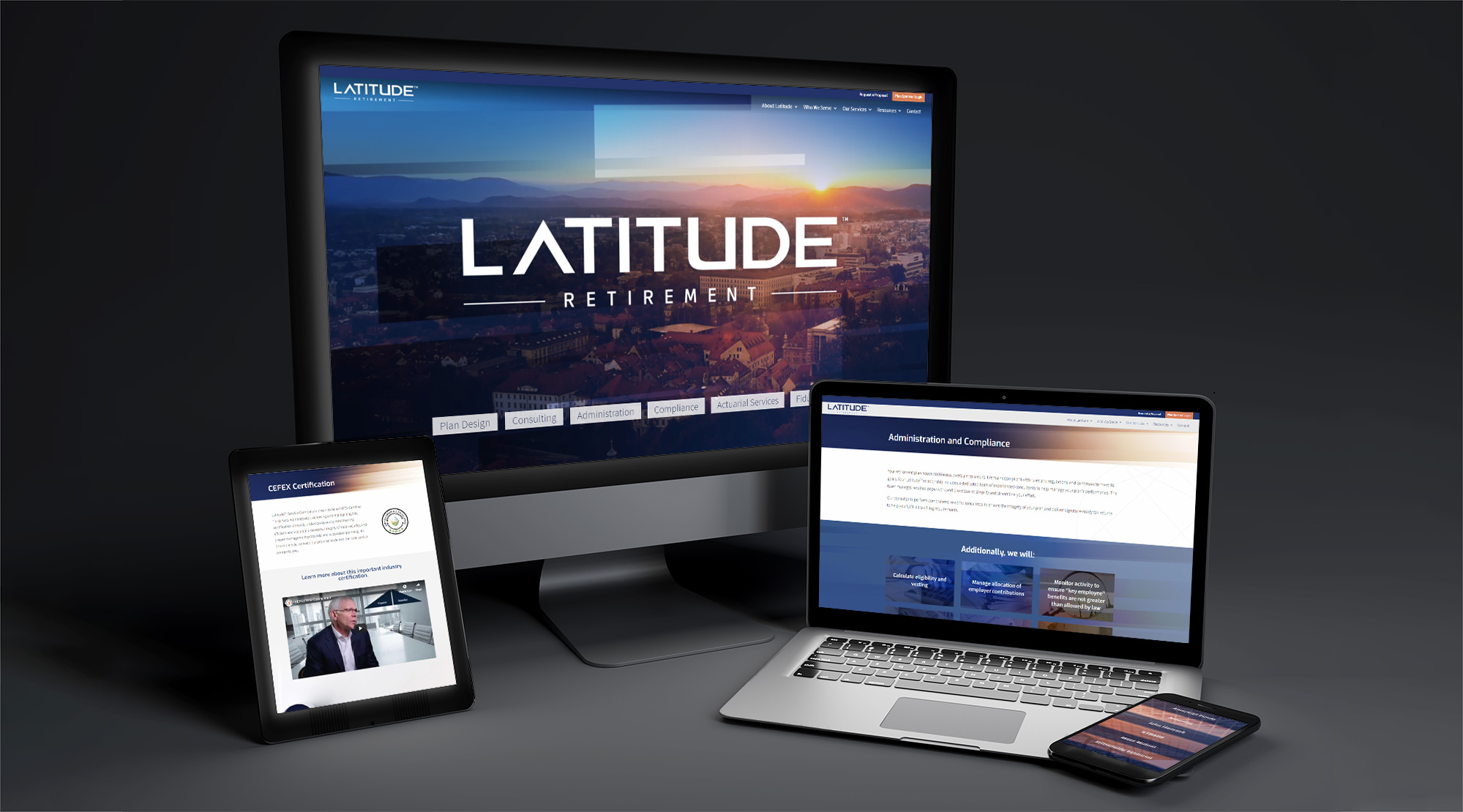
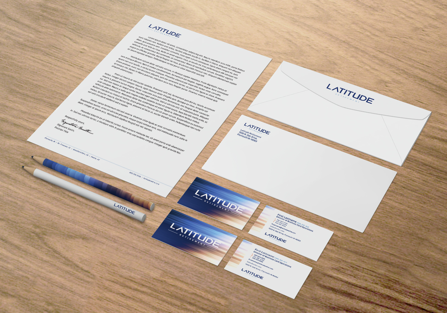
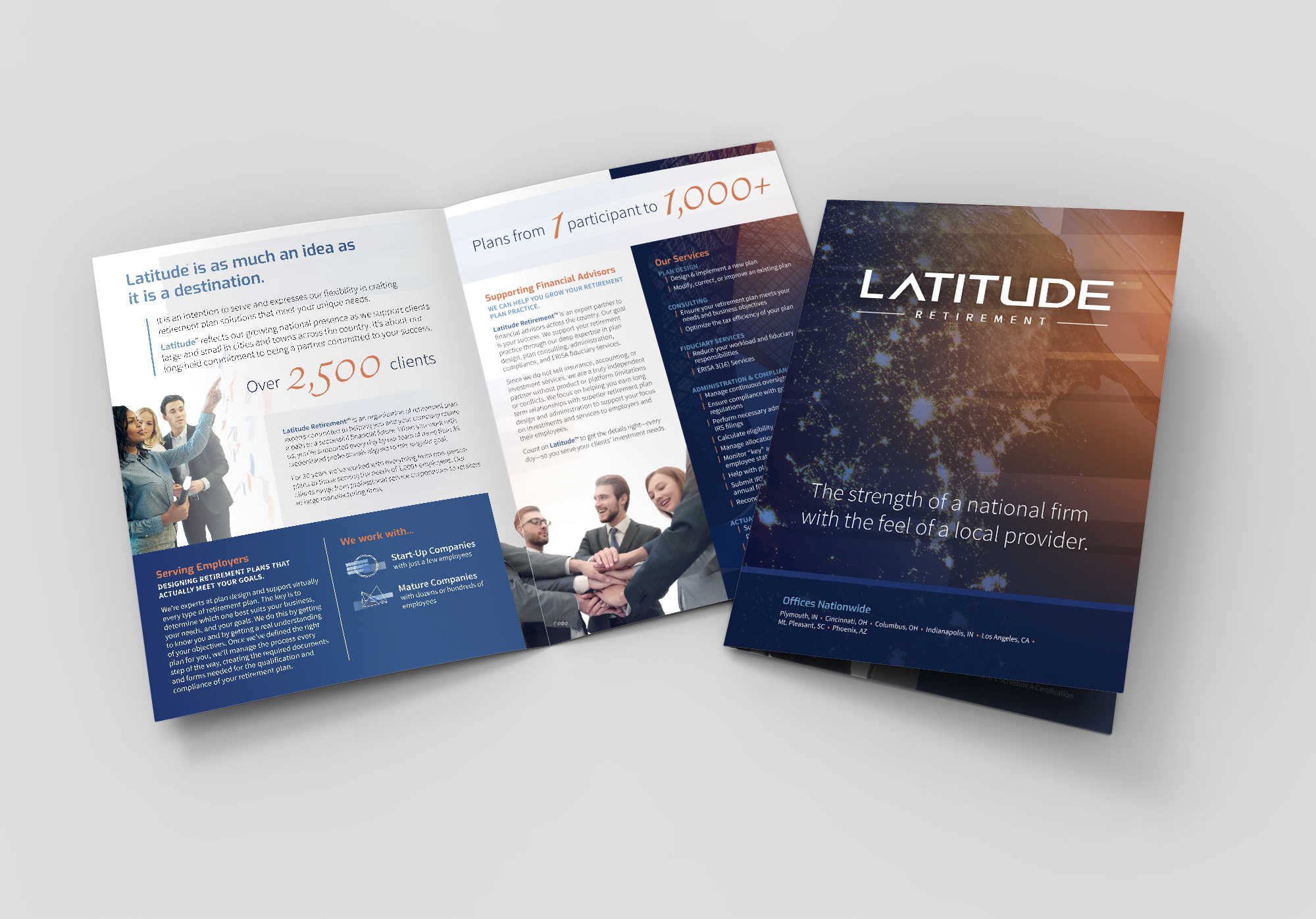
Working closely with their leadership, GSM styled their new face—”Latitude”—from the ground up. We furnished Latitude with a strong, bold logo and support it with glossy visual effects and imagery that symbolically captures the innovative, personal, exacting perspective Latitude’s stature affords its tenured professionals.
This identity represents their business as the upright, insightful, and powerful presence it has become as a national collaboration of companies.
Services Provided:
Branding & Identity, Corporate Stationery, Brochure Design, Web Development
color + fonts
Facto Medium // Exo Semibold
ABCDEFGHIJKLMNOPQRSTUVWXYZ
Source Sans Pro
abcdefghijklmnopqrstuvwxyz

logo
imagery

corporate stationery
custom icon style
print marketing
website design