Harvest Visual Identity
When Harvest Volatility Management teamed up with GSM in 2017, their visual identity was built around literal uses of the word “harvest.” Their logo featured a bundle of grain, their home page displayed a vast field of wheat, and so on. As one of the world’s leading derivative asset management firms, Harvest was tired of being mistaken for an agricultural company, and that meant they were ready for a new look.
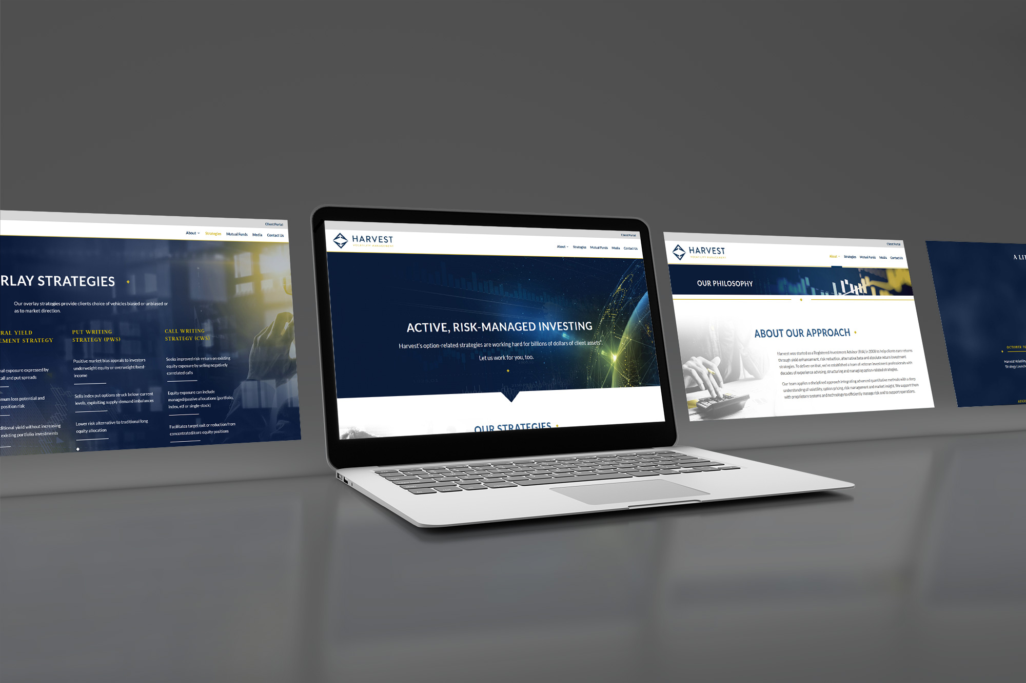
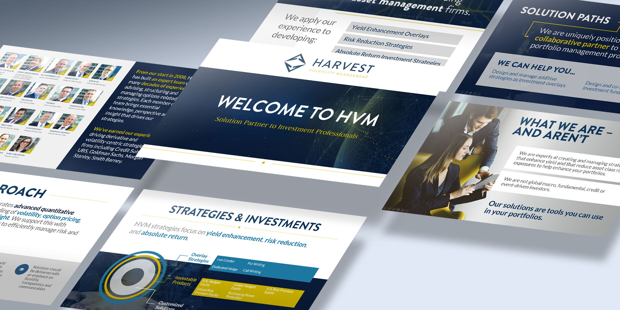
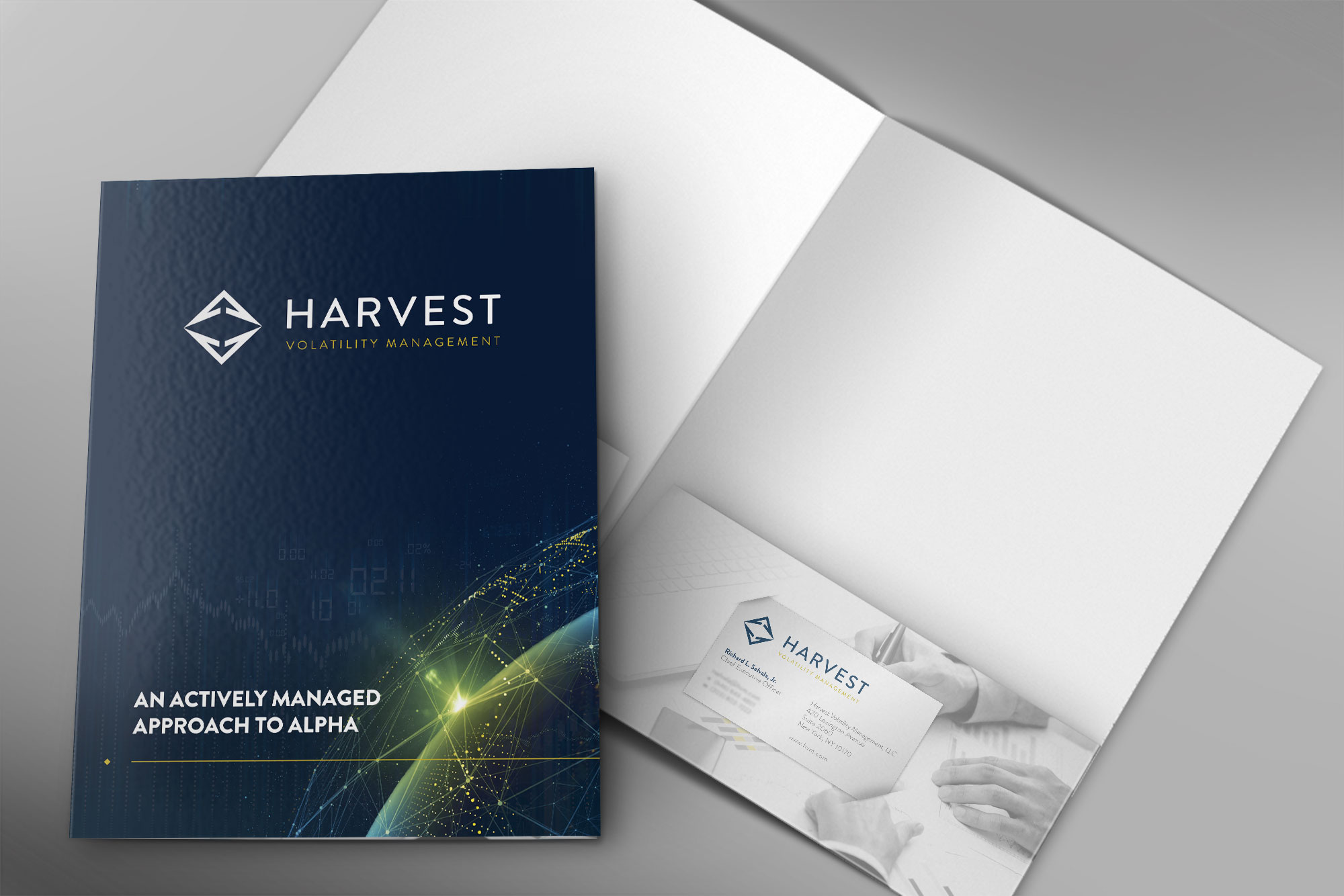
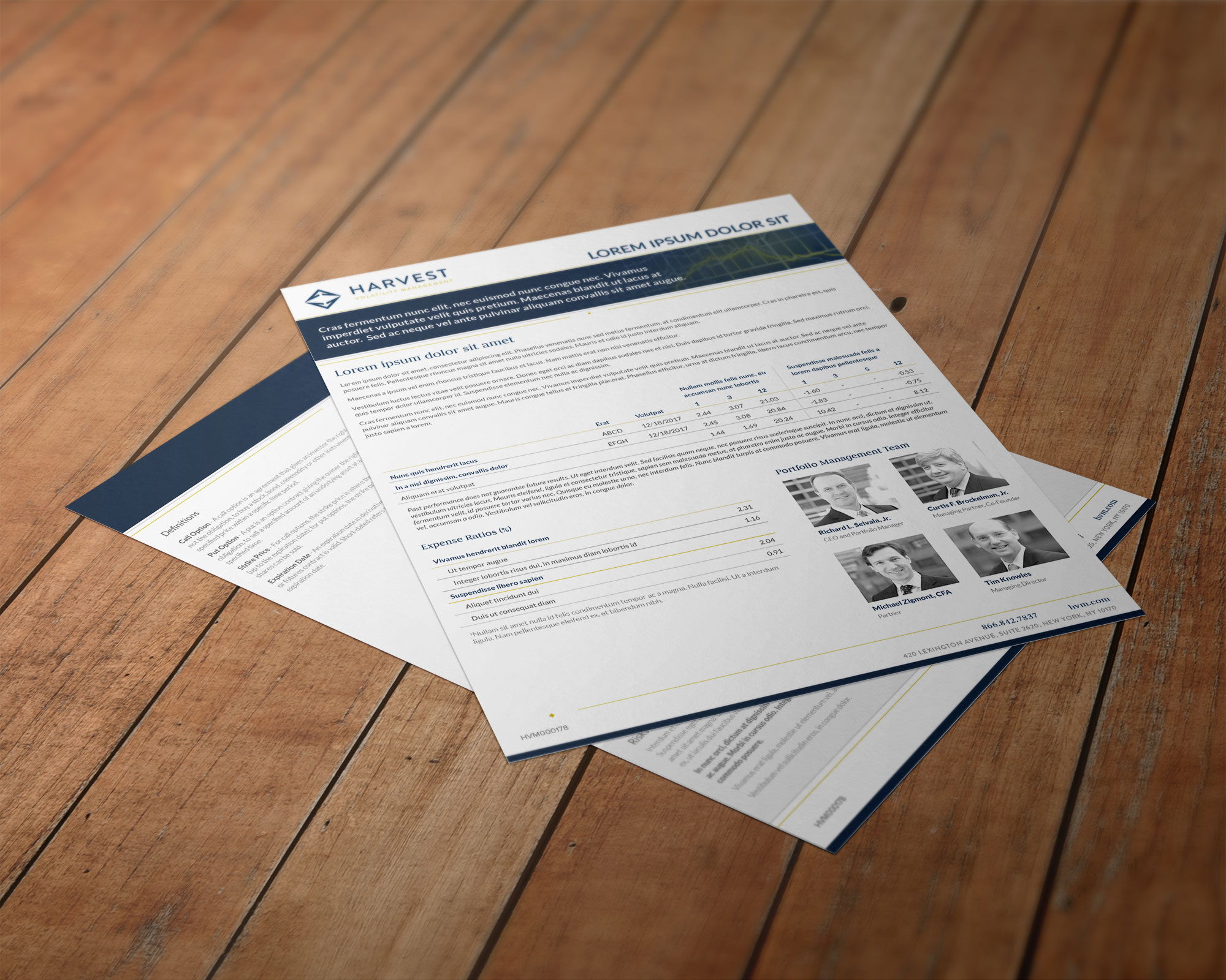
Starting from the ground up with a brand new logo that symbolizes their command over volatile movement in the investment world, we assembled a new visual identity that presents Harvest as the profoundly experienced and domineering financial professionals that they are. It features rich blues, elegant silvers, and pops of bright acidic gold; its impactful imagery depicts energized workspaces and dramatically luminous, data-driven illustrations. Nobody’s going to mistake them for farm workers any more, that’s for sure.
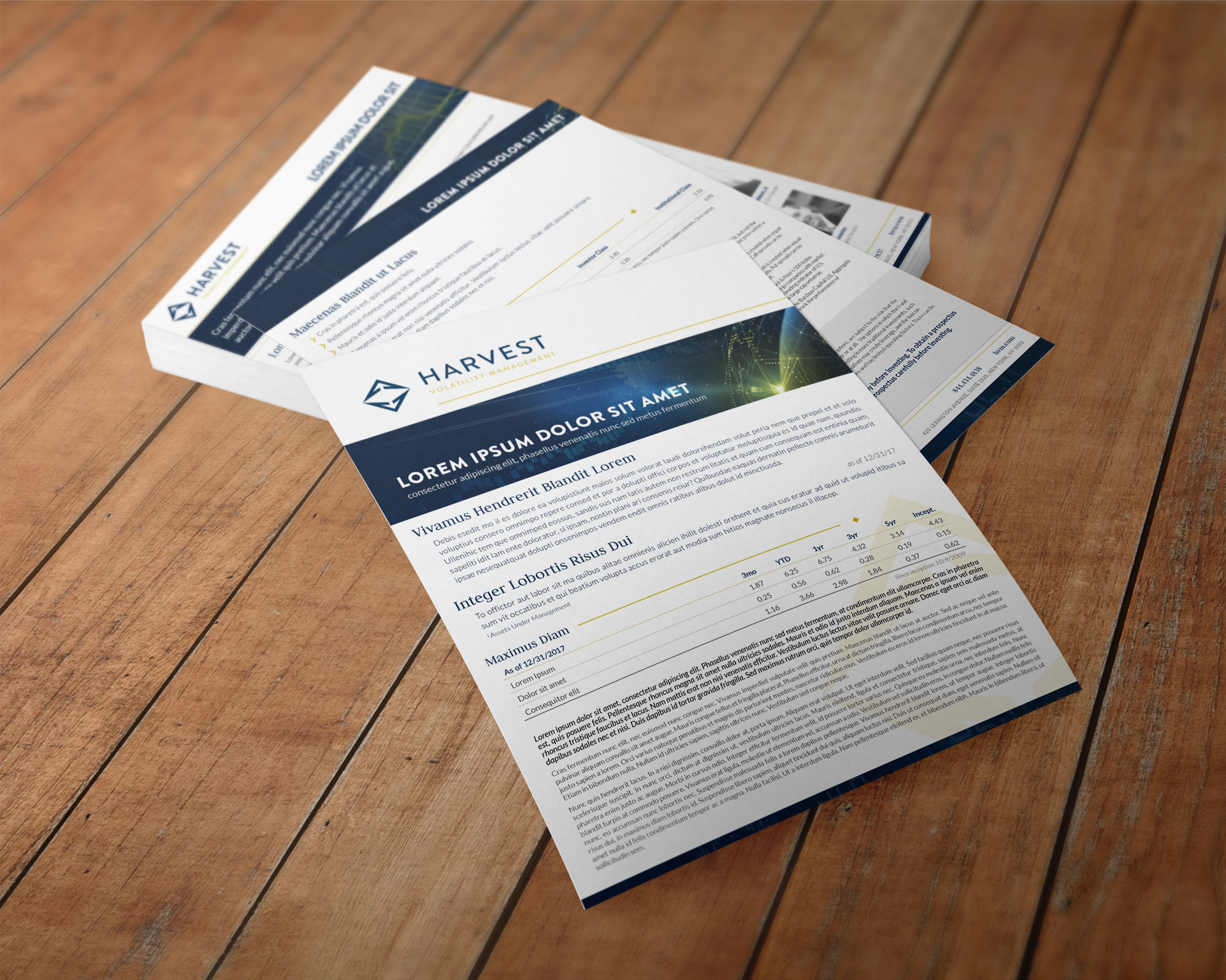
From there, Harvest had entire libraries of resources to re-style and unify with their new image. Alongside the Harvest team, GSM helped to redesign and even re-write a key selection of their assets, including but not limited to custom presentation decks, industry-quality print materials for both marketing and business communication, and even lent a hand when they wanted to manage internal video projects.
Services Provided:
Branding & Identity, Web Development, Custom Video, Print Marketing, PowerPoint Presentations
color + fonts
LATO
ABCDEFGHIJKLMNOPQRSTUVWXYZ
Judson
abcdefghijklmnopqrstuvwxyz

logo

imagery


Presentation
website design